
Accessibility as the brief
The Grayson DTLA
A Downtown LA bar site built to WCAG 2.1 AA, with an eleven-preference accessibility panel, a public conformance statement, and a signed client acknowledgment.
- Role
- Designer and engineer
- Year
- 2026
- Org
- Axlecore
- WCAG 2.1 AA
- Conformance target
- Accessibility implementation summary, the-grayson/docs
- 11
- User-adjustable accessibility preferences
- ADAWidget, the-grayson/app/components
The room, translated
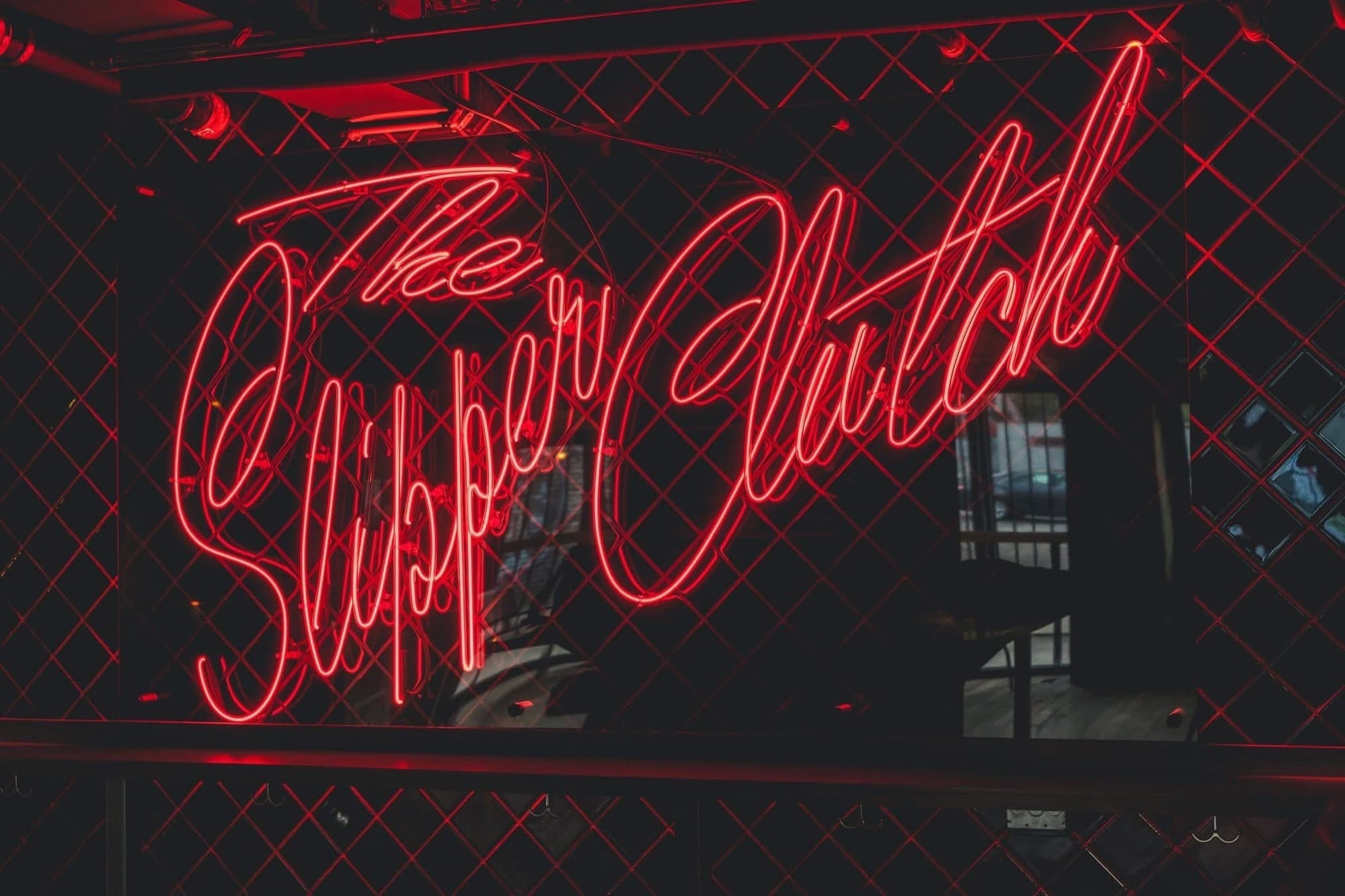
Grayson is low and warm where the Slipper Clutch is loud and vintage: controlled energy, glass and metal, a room that has already decided what it is. The design problem was translating a material feeling onto a screen that has neither material nor light.
The palette is warm-neutral rather than cool: a stone ramp running from near-black to bone, with a single amber accent. That one choice carries most of it. The same layout in cool greys reads as a software product; in warm greys it reads as a room with lamps in it.
Four typefaces, each with one job. Bebas Neue, condensed, for the headline weight a venue needs. Allura, a script, for the moments the brand wants to feel handwritten rather than set. Plus Jakarta Sans for body copy that stays legible at length, and Quicksand where a softer edge suits. Four families is more than a site usually earns; a venue is a brand before it is a website, and each one is doing work the others cannot.
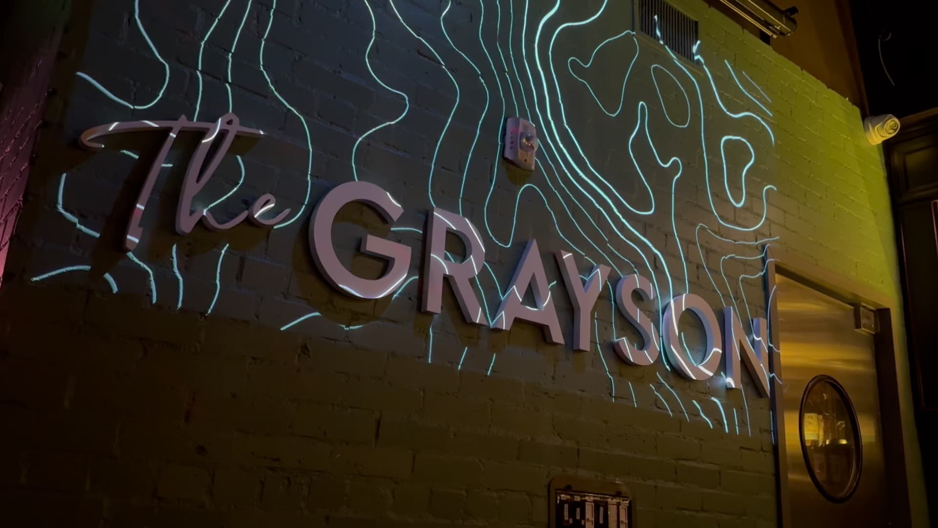
Texture does the rest: framing elements, a topographic pattern, a wall surface behind the sections. A bar sells a physical space, and flat panels sell nothing. The frames are doing digitally what moulding does in the room: telling you where one thing ends and another begins without drawing a hard line.
There is a press section because a Time Out feature is worth more to someone deciding where to go on a Friday than anything the venue can say about itself.
All of it is atmosphere for a room that anyone can walk into off Broadway. The site had to work the same way, and that turned out to be the harder half of the job.
Why a bar site needed this
A venue open to the public is a place of public accommodation, and in the United States its website is treated as an extension of it. ADA Title III suits over inaccessible hospitality sites are routine and cheap to file. For a single-location bar, one demand letter costs more than the site did.
So accessibility was not a polish pass at the end. It was the brief, and it shaped what got built.
The panel
Most accessibility widgets are a third-party script that overlays the page and, fairly often, makes things worse. This one is a component in the codebase, so it manipulates the site's own styles rather than fighting them.
It carries eleven preferences: text size, high contrast, reduced motion, link highlighting, text spacing, line height, text alignment, visible tooltips, hide images, an oversized panel mode for people who struggle with the panel itself, and a reset. Every choice persists to localStorage and applies without a reload.
The oversized mode is the one I would not have thought of unprompted. An accessibility panel that is itself hard to operate is a joke at the user's expense, so the panel can enlarge itself and move to the left for desktop users who need that.
What conformance actually took
A skip link to main content. Full keyboard operation of every menu, button and interactive element, the panel and back-to-top button included. Visible high-contrast focus indicators, strengthened to a 3px amber outline when high-contrast mode is on. Semantic landmarks and a real heading order. ARIA labels on the compound controls. Descriptive alt text where an image carries meaning, and `alt=""` where it does not.
Verification was manual as well as automated: screen reader passes with NVDA and VoiceOver, keyboard-only navigation, contrast tooling, and semantic validation.
The site publishes an accessibility statement at /accessibility covering conformance status, known limitations and how to report a problem, because a conformance claim nobody can question is not a conformance claim. That page, and a signed client acknowledgment recording what was implemented and what remains the client's ongoing responsibility, are the part that actually reduces legal exposure.
Built on the previous engagement
Grayson came from the same client relationship as The Slipper Clutch, and five components carried across: the age gate, the events table, the CTA section, the footer and the preloader. That is a real saving, and it is also the honest size of it. The two sites are separately styled, and Grayson roughly doubled the component surface with the accessibility panel, full navigation, scroll reveal and a card linking back to its sister venue.
The reuse that mattered was not code. It was knowing what a venue site has to do: that events are the reason anyone visits, that an age gate cannot be an afterthought, and that the people updating it are not technical.
The panel, working
Tonight
The Grayson DTLA
Doors at eight. Live set at ten. See the full calendar for the week ahead.
Five of the eleven preferences shipped on thegraysondtla.com.
Built with
- Next.js
- React
- TypeScript
- WCAG 2.1 AA
- ARIA
- NVDA
- VoiceOver
- Vercel